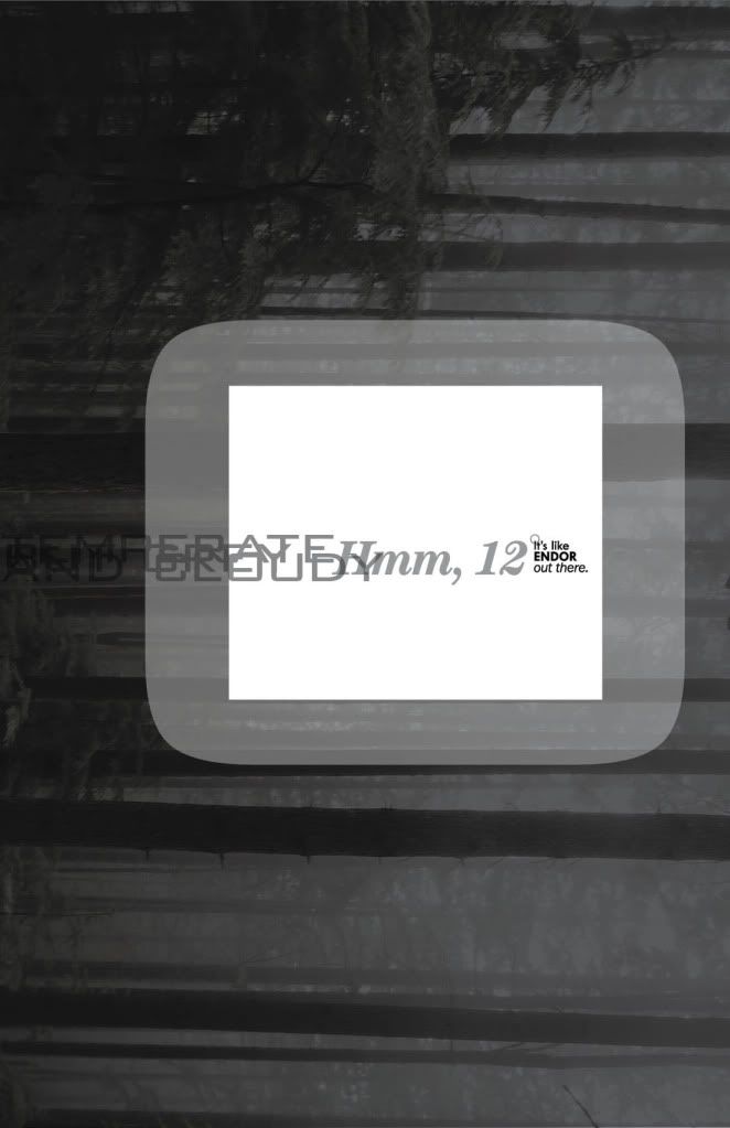
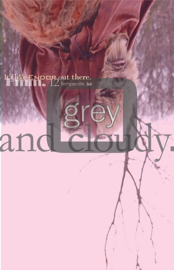
I want to layer all fall/winter.
These are the collections of Fall10 I'd like to mimic this year:

ANNA SUI

ADAM
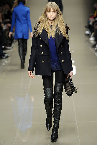
BURBERRY PRORSUM

JCREW

TWENTY8TWELVE
Working on a lot, lately. Just finished another quarter with all As (I'm anticipating). My favorite was my branding class in which I had two awesome teachers (Holly Hadley and Joanne Tepper-Safren). They fed us well and taught us so much. We loved that class. I'm thinking about even pitching some designs I did to the actual places I fictionally redesigned for!
Also when it comes to branding, please stop by the wonderful Rockin' Cupcake Cafe in Folsom. I did the logo, menuboard, mission statement, product cards and shirts. I hope I get to do more because it is a fun system to design for! I mean, come on! Cupcakes, man! And music! I also helped a little with the environmental design. My teacher and classmates are already addicted. My classmates are addicted to the mocha, for sure! (http://www.yelp.com/biz/rockin-cupcake-cafe-folsom)
I am also working on three other branding projects... so this break I'm planning to go all bohemian: frugal, pondering love, reading a ton of books I checked out, writing poetry, traveling photoshoots of my friends, and art art art art art!!! I'm starting to go deeper into some really philosophical questions I have about my generation and I'm going to dip into collage.