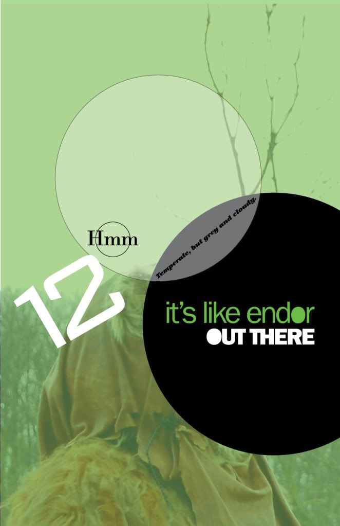
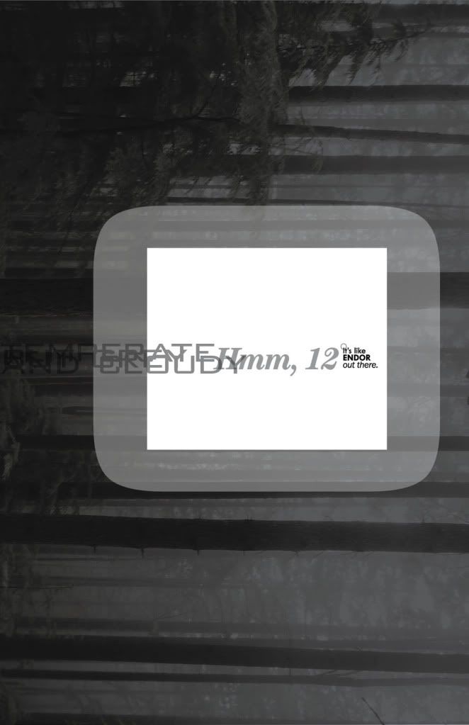
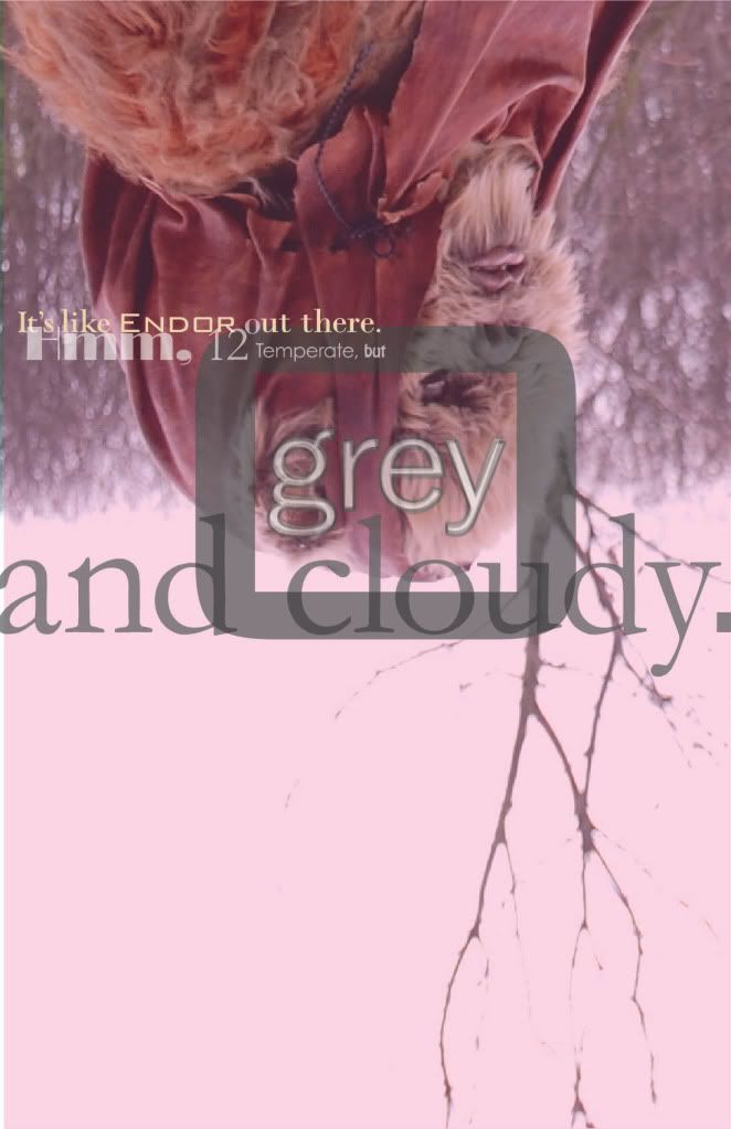
Using my past compositions as inspiration, these compositions feature a weather report from a fictional Star Wars setting.
Another given objective in this project was to include a subtle nod to a paragraph in my design brief. The paragraph I chose was a short list of some of the fonts Benton designed. They are each used, here.
---
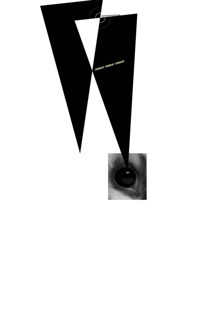
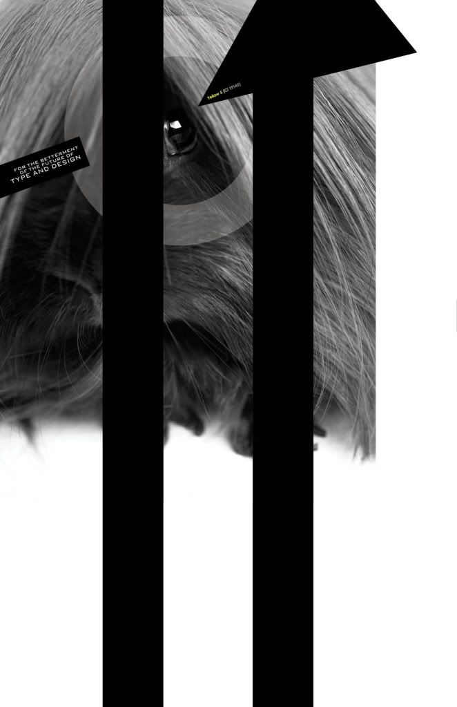
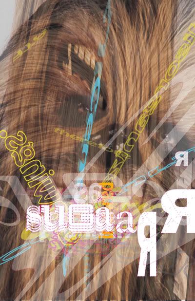
Moving forward with the theme of bath products, I designed a list of ingredients in a shampoo.
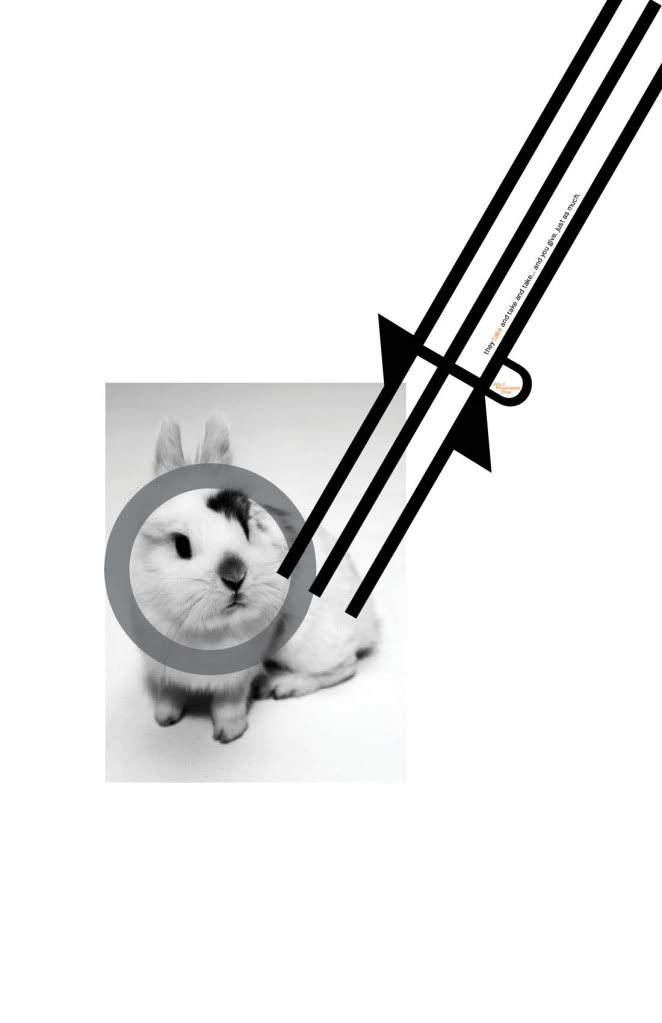
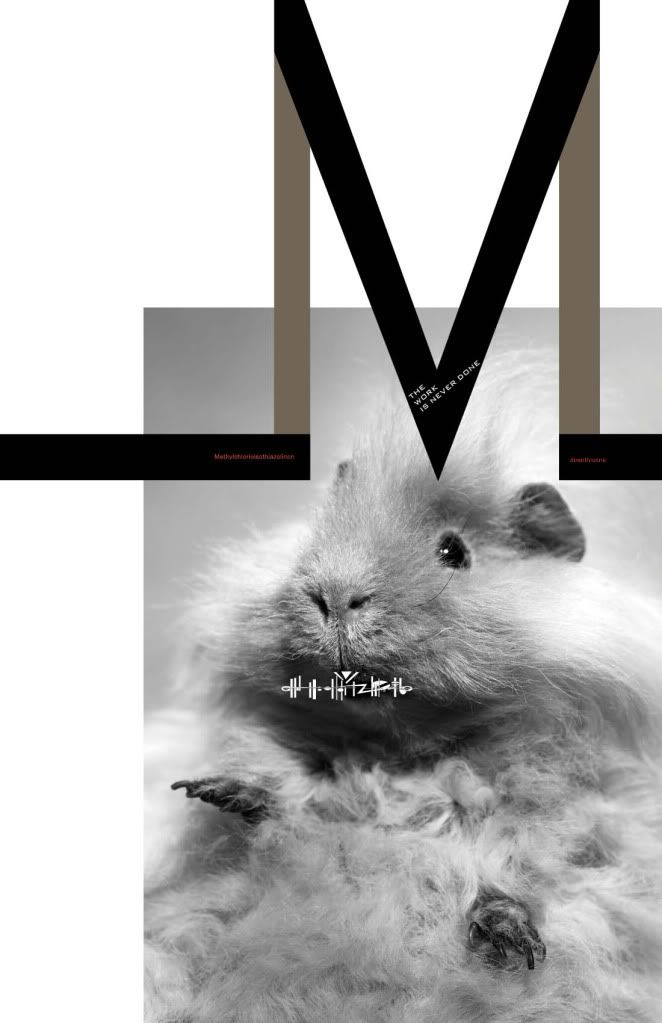
These posters highlight the over-worked existence of animals that are used for product testing and the overworked Benton, himself.
These compositions also show an abstraction of geometric shapes from typeforms in Benton’s font, Franklin Gothic. Benton’s Bank Gothic is used as a secondary font.
Using Franklin Gothic, I created abstract shapes that reflect the word shapes creates by the chemicals found in a shampoo I have at home. I can outline each letter in the joining of the forms I chose. I decided to reflect how cornered and used Benton felt by portraying animals going through "product testing".
---
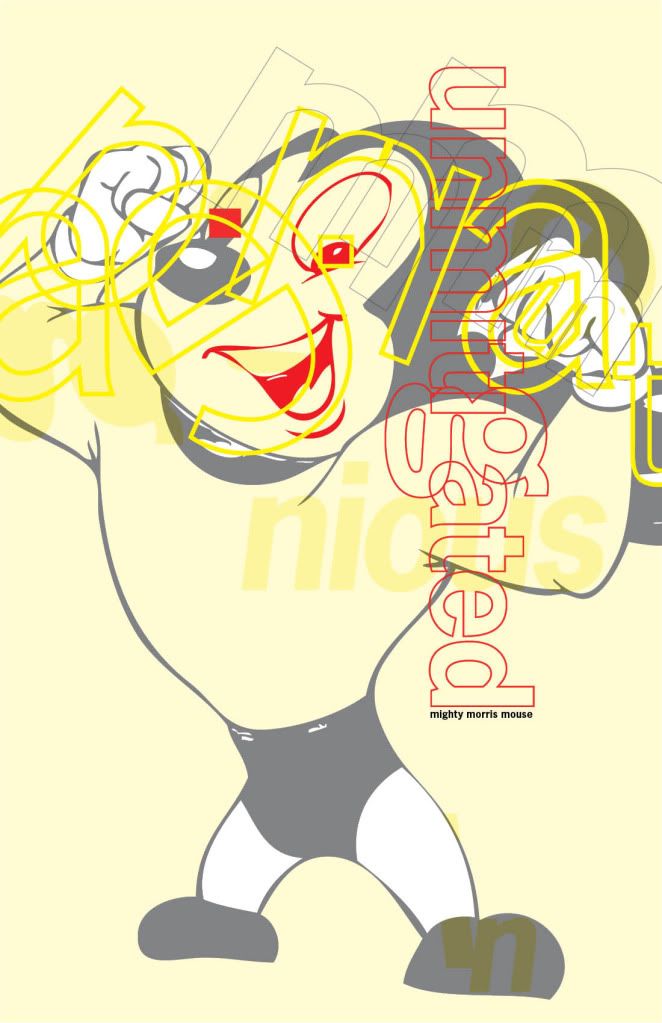
I did these projects with a group of peers. For this composition I took the three words a peer used to drive the design of their own “Apprentice” poster and applied them to Morris Fuller Benton’s persona. These words were: Abberant, unmitigated and ingenius.
Moving forward with my small creature theme, I compared Benton to the “mightiest” rodent. He was far from helpess!